EXPLORE
Role: User Research, Sketching, Wireframing, Usability Testing
Team Members: Anne Morris (Scrum Master), Theo Davis, Matt Penayor & Gabriella Hunt
Tools: Invision Freehand, Illustrator, XD
Project Duration: 3 months
Overview
Explore is a mobile app that is designed to make organizing your next trip easier. This travel planning app allows its users to invite friends to view an upcoming trip itinerary and vote on places of interest. To avoid the stress of planning a group trip alone, we've designed an app that allows everyone to be a part of the planning process.
For this project, our team used the Lean UX approach while integrating an Agile development methodology. By creating a Minimum Variable Product (MVP) we were allowed to test our assumptions through an iterative sprint cycle process.
Challenges
How might we create an easy to use app while identifying what people really want, when they use a travel planning app for group travel?
Ideation
We began our process with an affinity mapping exercise to help us determine emerging patterns for traveling and planning a trip. This helped us to sort our ideas and understand any possible challenges.
Users
Once our research process was completed we used that information to develop our prospective user (prototype persona).
Design Process
With the user being at the forefront of our design process we defined our problem statement. Then each team member created a list of assumptions we believed to be true. We discussed and collaborated our assumptions and developed them into hypothesis statements. We worked together to prioritize the hypothesis statements which then became our product backlog.
Completing our Hypothesis Statements
Wireframe & Low Fidelity Prototype
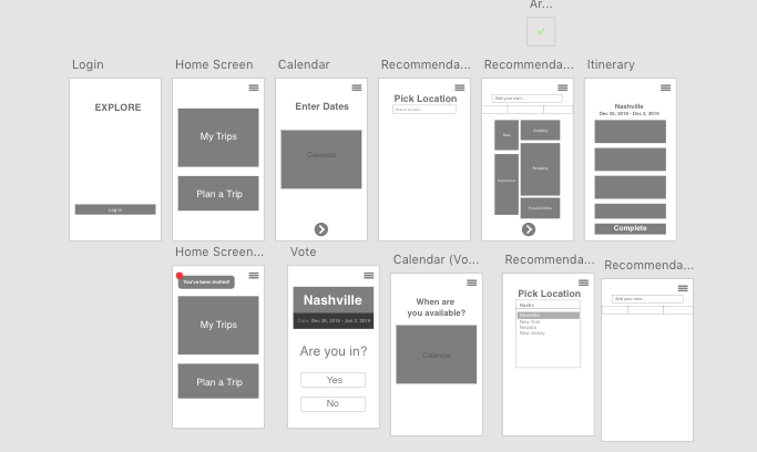
Sketches were completed and we actively worked together to create our wireframes. After which we developed a low fidelity prototype for user testing.
User Testing and Research
We continued to work on improving our MVP and retested. Users seemed a like confused on the "pick location" screen. They weren't sure if they needed to type or select a location; so our team decided it would be best to put a dropdown menu instead. We also tried to input a scroll bar but the prototyping software didn't have the capabilities, and we believed the users didn't understand how to pick things to do (activities).
After our second round of user testing we took that information and began to develop a high fidelity prototype, we also focused on our brand identity and rectified issues faced by the users.
We completed another round of testing with our High Fidelity Prototype and gathered that the wording on our buttons should be simplified, there were some unnecessary activity screens that were confusing the user, which resulted in some changes in the paths some screens followed. Once those changes were completed we tested the prototype and we were satisfied with the results.
Click the button below to view the prototype.
Branding
What we've learned
We learned that people using this travel app liked the idea of having recommendations. We assumed they would like to have voting and collaborative features but later realized recommendations of things to do when planning a trip were as equally as important to them as the other ideas.
Reflection
This was our team's first Lean UX Agile project and I enjoyed the iterative process. I believe it allowed us to keep improving on our MVP. Although the time went by very quickly, it provided us with a better understanding of how we had to manage our time in such a fast paced environment.
